
Why Most Landing Pages Fail (And What the Top 10% Do Differently)
Here's a number that should bother every funnel marketer: the average landing page conversion rate sits at just 2.35%. That means 97 out of every 100 visitors you paid to acquire leave without taking action. Meanwhile, the top 10% of landing pages convert at 11.45% or higher — nearly five times better. That gap is not luck, and it's not budget. It's the systematic application of practices that most marketers skip, rush, or simply misunderstand.
This post breaks down the principles that actually move the needle, backed by what the research shows works in 2026 and beyond. Whether you're building a lead capture page, a product launch page, or a free trial signup flow, the same core framework applies. And if you're still duct-taping together pages in a general website builder, we'll cover which dedicated landing page platforms give you the technical and analytical firepower to actually compete.
1. Engineer Your Value Proposition Above the Fold — Every Time
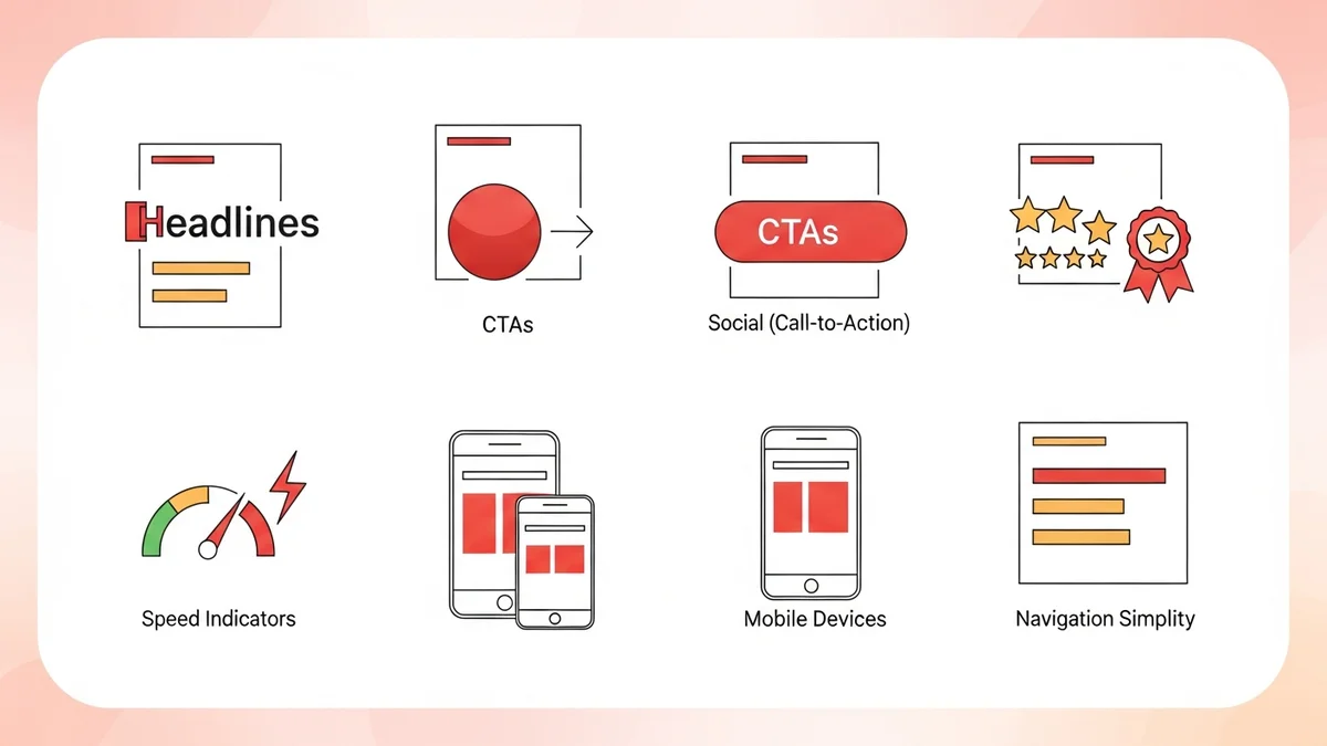
The single highest-leverage change you can make to any landing page is strengthening the value proposition in the first viewport. Before a visitor scrolls, before they read your bullet points, before they even notice your CTA button — they decide in under five seconds whether this page is worth their attention. That's not an opinion; it's the operative constraint your headline must be designed around.
A weak value proposition is the leading cause of high bounce rates and low conversion rates, full stop. And the mistake most teams make is confusing a value proposition with a tagline. They are not the same thing. A tagline is brand-facing. A value proposition is visitor-facing, and it has to do four distinct jobs simultaneously:
The Four Pillars of a High-Converting Value Proposition
- Relevance (The "Who"): Explicitly identify the target visitor and their critical pain point. If your headline could apply to anyone, it will resonate with no one.
- Unique Solution (The "What"): State specifically how your offer solves that problem — not what category of solution it is, but what it actually does.
- Quantifiable Outcome (The "Why"): Make a concrete, measurable claim about the result. "Better results" is meaningless. "50% more qualified leads in 30 days" is not.
- Differentiator (The "How"): Briefly explain why your approach outperforms alternatives. This is what makes the value proposition defensible rather than generic.
The full value proposition is not just the H1 headline. It's the H1 plus a supporting subheadline plus two or three bullet points that together cover all four pillars. If you're missing any one of those components, the proposition's structural integrity breaks down — and so does your conversion rate.
Tools like Unbounce and Instapage are built with this reality in mind, offering above-the-fold layout templates specifically optimized for immediate value communication. That's not incidental — it's because the platforms know that the fold is where conversion decisions are made.
2. Eliminate Friction — Both Technical and Psychological
Friction is anything that adds hesitation between a visitor's intent and the action you want them to take. There are two kinds, and you need to treat them separately because they have different causes and different fixes.
Technical Friction
Technical friction is the easier category to address because it's measurable. Page load speed is the canonical example. A one-second delay in page load time can reduce conversions by 7%. Mobile pages that aren't truly optimized — not just "responsive" but designed for thumb-tap interaction — lose visitors at rates that desktop analytics often mask. If you're running paid traffic to a page that loads in 4 seconds on mobile, you're essentially setting money on fire in the upper funnel.
Form length is another technical friction point that's chronically underestimated. Every additional form field you add drops conversion rate. The question to ask is not "what information do we want?" but "what's the minimum we need to make this conversion meaningful?" For most lead gen pages, that's a name and email. Everything else should be collected post-conversion.
Psychological Friction
Psychological friction is subtler and more damaging because it operates below the level of conscious thought. It includes:
- Risk perception: The visitor doesn't trust that your offer delivers what you claim.
- Commitment anxiety: The ask feels too large relative to the demonstrated value.
- Cognitive overload: Too many competing elements, headlines, or CTAs force the visitor to make a decision they don't want to make — so they make none.
- Navigation leakage: A header with a full site nav gives visitors eight places to go that aren't your CTA. Dedicated landing pages remove that escape hatch entirely.
The principle of singular focus — one page, one goal, one CTA — is not a design preference. It's the structural answer to cognitive overload. Every element on the page should either build the case for the conversion or remove a barrier to it. If an element does neither, it's friction.
Newsletter
Get the latest SaaS reviews in your inbox
By subscribing, you agree to receive email updates. Unsubscribe any time. Privacy policy.
3. Build Trust With Social Proof That Actually Converts
Social proof on a landing page is not optional in 2026. Visitors arrive with skepticism baked in — they've been overpromised before. The question is what kind of social proof works, because not all of it is equally persuasive.
The Social Proof Hierarchy
Here's the rough hierarchy from most to least persuasive, based on how it lands with a skeptical visitor:
- Case studies with specific, named outcomes — "Company X increased conversions by 43% in 60 days" outperforms any testimonial.
- Named, attributed testimonials with photos and job titles — "Great product!" from John D. carries almost zero weight. "Cut our cost-per-lead by 35%" from Sarah Chen, VP Marketing at Acme Corp, carries weight.
- Recognizable brand logos — "Trusted by" sections work, but only if the logos are recognizable to your target audience. Obscure logos are almost worse than nothing.
- Aggregate statistics — "10,000+ customers" works as a credibility anchor, not a conversion driver on its own.
- Star ratings without context — The weakest form of social proof. Necessary but not sufficient.
Place your strongest social proof immediately below the fold — not buried near the footer. The visitor who scrolls past your headline is already partially interested; that's the moment to reinforce with proof, not wait until they're halfway down the page wondering if they should leave.
4. Conversion Rate Benchmarks: Where You Stand and Where You Should Aim
Understanding benchmarks matters because it calibrates your ambition. Most teams are satisfied when they beat the average, but the average is a low bar. Here's how conversion performance breaks down across the industry:
| Performance Tier | Conversion Rate | What It Tells You |
|---|---|---|
| Bottom 50% (underperformers) | Below 2.35% | Fundamental issues with value proposition, traffic match, or page structure |
| Average (all industries) | 2.35% – 5.89% | Basic best practices applied, but significant friction still present |
| Good (above average) | 5.89% – 8% | Strong value proposition, reasonable UX, some A/B testing in place |
| Top 10% (elite performers) | 11.45%+ | Systematic optimization, strong social proof, near-zero friction, personalization |
The data is from Salespanel's 2026 analysis and HubSpot's 2023 industry study. What's striking about these numbers is the non-linearity: getting from 2% to 5% is a meaningful improvement, but getting from 5% to 11% requires a fundamentally different approach — not just better copy or prettier design, but a precision-engineered system where every element is tested, validated, and purposeful.
5. Your CTA Is the Conversion — Treat It That Way
Most CTAs are an afterthought. The team spends weeks on the hero image and 45 minutes on the button. That's backwards. The call-to-action button is the literal point of conversion, and it deserves the same rigorous thinking as your headline.
What Makes a CTA Button Convert
Specificity beats genericity every time. "Get Started" is vague. "Start My Free 14-Day Trial" is specific, benefit-forward, and removes the commitment anxiety around "getting started" implies an unclear commitment. "Download the Guide" beats "Submit." "Claim My Spot" beats "Register." The more your CTA language mirrors the specific outcome the visitor is about to receive, the higher it will convert.
Visual contrast, not just color. The button needs to be the most visually dominant element in the CTA section. Not just a contrasting color, but dominant in size, whitespace, and surrounding visual weight. Visitors shouldn't have to search for where to click.
Reduce the perceived risk around the button. Add a single trust-reducing line directly beneath or beside the CTA: "No credit card required," "Cancel anytime," "Free for 30 days." These micro-commitments address the most common objection at the exact moment the visitor is deciding whether to click.
CTA Placement Strategy
The CTA should appear above the fold on every landing page without exception. For longer pages (which are appropriate for higher-ticket or more complex offers), repeat the CTA at natural stopping points — after your social proof section, after your feature breakdown, and at the page footer. Each repetition should be contextually appropriate, not identical. The above-fold CTA can be awareness-level ("See How It Works"). The mid-page CTA can be consideration-level ("Compare Plans"). The bottom CTA can be decision-level ("Get Started Today").
6. A/B Testing Is Not Optional — It's the Whole Game
The gap between a 2.35% conversion rate and an 11.45% conversion rate is not explained by one brilliant insight. It's explained by a disciplined testing culture that iterates relentlessly. Top-performing landing pages don't get built right the first time — they get tested right over dozens of iterations.
The right A/B testing sequence for most teams is:
- Headline first. Your value proposition headline has the highest leverage of any single element. Test it before anything else.
- CTA copy second. Once you have a winning headline, test button text and placement.
- Social proof third. Test which proof elements — case studies, testimonials, logos — resonate most with your specific audience.
- Form length fourth. Test removing fields and measure the impact on lead quality versus volume.
- Page layout last. Layout changes are expensive to implement and hard to interpret. Save them for after you've optimized the elements above.
The platforms that make this practical are the ones worth paying for. Leadpages offers built-in A/B testing on its Standard plan, making it accessible for smaller teams. Kartra goes further with multi-variate split testing integrated directly into its funnel analytics. GoHighLevel is particularly strong for agencies running tests across multiple client accounts simultaneously. If testing infrastructure isn't built into your platform, you're working harder for worse results.
7. Choosing the Right Landing Page Platform Accelerates Everything
The best practices above are platform-agnostic in principle, but your platform determines how fast you can implement, iterate, and scale them. Not all landing page builders are created equal, and the wrong choice creates friction in your own workflow — which translates directly into slower optimization cycles and lower conversions over time.
Here's the honest breakdown of how to think about platform selection for landing pages specifically:
If you're running high-volume paid traffic and need advanced analytics, dynamic text replacement, and personalization at scale, Instapage and Unbounce are the purpose-built choices. Instapage's heatmapping and Unbounce's Smart Traffic AI for routing visitors to the highest-converting variant are features designed precisely for serious conversion optimization work.
If you're an all-in-one funnel builder looking for integrated landing pages inside a larger marketing stack, Kartra and GoHighLevel handle landing pages competently within a broader CRM and automation context. You sacrifice some of the specialized optimization features of dedicated tools but gain workflow consolidation.
If you're cost-sensitive or just starting out, Systeme.io offers a remarkably capable free tier that includes landing pages, funnels, and email automation. The conversion optimization tooling is less mature than premium alternatives, but for teams still building traffic and testing initial offers, it's hard to argue against the price point.
The worst option is building landing pages inside a general-purpose CMS without a dedicated tool. You lose A/B testing, you lose performance optimization, and you lose the analytical instrumentation needed to actually understand why a page is or isn't converting. The ROI on a dedicated landing page platform pays for itself quickly when you're driving any meaningful traffic volume.
The Bottom Line: Precision, Not Polish
Landing page best practices in 2026 are not about aesthetics. They're not about having the most modern design or the cleverest copy. They're about building a precision instrument: a page where every element — headline, subhead, social proof, CTA, form — works together to eliminate the cognitive and technical friction standing between a visitor's intent and your conversion goal.
The data is unambiguous: the top 10% of landing pages convert at more than four times the industry average. That performance gap is earned through systematic application of the principles above, sustained testing, and the right platform infrastructure to support rapid iteration. Get the value proposition right first. Eliminate friction second. Test everything third. The conversion rates follow.